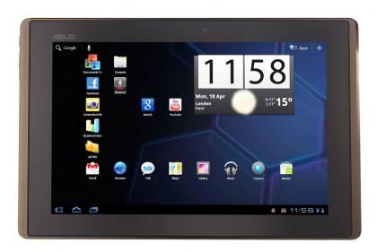
Asus Eee Pad Transformer review
The worry we had with Android 3.0 (Honeycomb) tablets was that they'd all be very similar and there'd be little to distinguish them, a bit like the current netbook market.
However, with the second Android 3.0 tablet we've reviewed, Asus has managed to make its Eee Pad Transformer very different to the Motorola Xoom . The main difference is that the Transformer has an optional keyboard dock, turning it from a plain tablet into a more powerful netbook.

We also feel that Asus has got the price right, with the 16GB model costing £380 without the keyboard dock or £430 with. Without the dock, it's around £20 cheaper than the Wi-Fi 16GB Apple iPad 2 . Given that Apple's tablet is the one to beat, Android tablets need to be cheaper in order to compete, which is partly where the Xoom went a bit wrong.
Just because the Transformer is cheaper than the iPad, it doesn't mean that it's cheaply made. While the plastic case isn't as nice as the all-aluminium body of the iPad, it feels tough. It's good that the sides are made of metal, to help protect the tablet when you carry it.
Using plastic means that the Eee Pad Transformer weighs 680g, which is just 80g heavier than the iPad 2. In use it means that it's comfortable to hold and we didn't get the urge to put it down as often as we did with the Xoom.

Asus has used an IPS panel for the 1,280x800 screen. Comparing it side-by-side with the iPad 2, we found that there was very little difference in terms of image quality. The Eee Pad Transformer's screen looks absolutely fantastic, with bright whites and deep blacks. Viewing angles are superb, too, as you'd expect from IPS. We like the wider aspect ratio of this tablet, as it leaves more room for web pages and other content than the iPad 2's lower-resolution screen.
As with the majority of new non-Apple tablets, the Eee Pad Transformer is powered by a 1GHz Nvidia Tegra 2 chipset. Its dual-core processor is very fast, powering through the Quadrant Android Benchmark with a score of 2,146, making it slightly faster than the Xoom. Running the SunSpider JavaScript Benchmark, the Transformer completed the test in 1,878ms, which is again slightly faster than the Xoom and iPad 2.
We found the Transformer slightly smoother and faster to use than the Xoom. The transition animation when switching between homepages was particularly smooth. We found web browsing that bit quicker, too, with transitions from portrait to landscape (and vice versa) quicker than on the Xoom. However, put this tablet next to the iPad 2 and Apple's seems faster and smoother, particularly in scrolling.

Leave a Comment